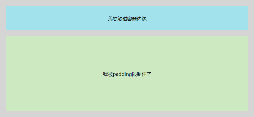
概要:我们在用UI库或者维护项目的时候,可能会遇到别人用div包裹了一层,并设置了padding,但是我们又想要让子元素突破padding的限制,让子元素和父元素一个宽度,本篇文章就是探讨这个问题的实现方案。
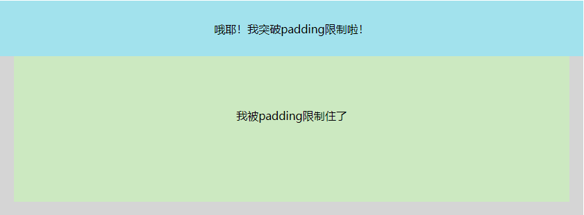
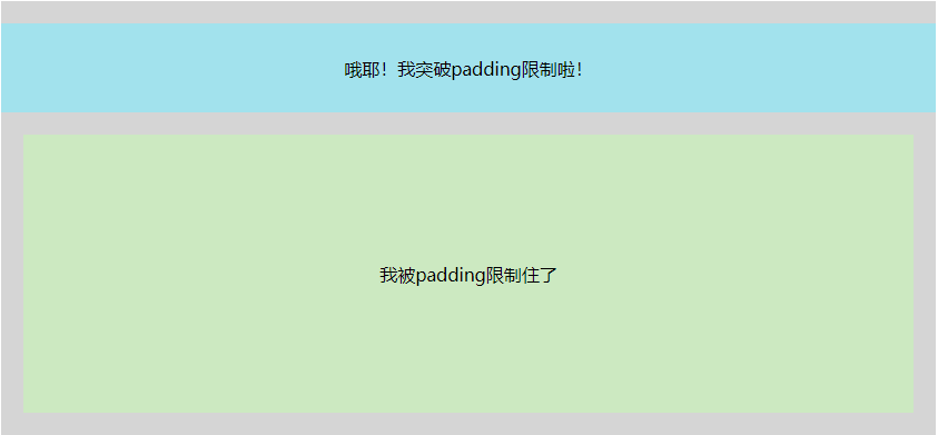
展示:
1
2
3
4
| <div class="warp">
<div class="header"></div>
<div class="content"></div>
</div>
|
大家有没有思路呀,首先来排除几个错误答案,设置display:inline-block,设置box-sizing: content-box。都是不能突破padding的。下面说一下我常用的两个解决方案。
解决方案
绝对定位
方案1是用绝对定位,让子元素脱离文档流。缺点就是下面已有的布局会被打乱。(header就是我们要突破padding的目标元素)
1
2
3
4
5
6
7
8
9
10
11
12
13
14
15
16
17
18
19
20
21
22
23
24
| .warp {
padding: 20px;
background-color: rgb(213, 213, 213);
position: relative;
width: 800px;
margin: 50px auto;
}
.header {
width: 100%;
height: 80px;
background-color: rgb(162, 226, 237);
position: absolute;
top: 0;
left: 0;
}
.content {
width: 100%;
height: 250px;
margin-top: 20px;
display: inline-block;
box-sizing: content-box;
background-color: rgb(204, 233, 193);
}
|
解决方案2
第二个方案是利用margin-left配合calc函数实现,利用margin-left突破左边padding限制,利用calc计算出父元素宽度+2倍padding值。
1
2
3
4
5
6
7
8
9
10
11
12
13
14
15
16
17
18
19
20
21
| .warp {
padding: 20px;
background-color: rgb(213, 213, 213);
position: relative;
width: 800px;
margin: 50px auto;
}
.header {
width: calc(100% + 40px);
height: 80px;
margin-left: -20px;
background-color: rgb(162, 226, 237);
}
.content {
width: 100%;
height: 250px;
margin-top: 20px;
display: inline-block;
box-sizing: content-box;
background-color: rgb(204, 233, 193);
}
|
结论
利用这两个方案,我们就能让子元素突破padding的限制啦!
 微信
微信 支付宝
支付宝